Ultra Responsive Design
Donec sed odio dui. Nulla vitae elit libero, a pharetra augue. Nullam id dolor id nibh ultricies vehicula ut id elit.
Retina Ready Display
Offbeat looks beautiful and Pixel Perfect on your High Resolution Devices like iPads, Macbooks or iPhones.
AJAX Portfolio Loading
Donec sed odio dui. Nulla vitae elit libero, a pharetra augue. Nullam id dolor id nibh ultricies vehicula ut id elit.
Touch Swipe Support
Donec sed odio dui. Nulla vitae elit libero, a pharetra augue. Nullam id dolor id nibh ultricies vehicula ut id elit.
30+ HTML Templates
Donec sed odio dui. Nulla vitae elit libero, a pharetra augue. Nullam id dolor id nibh ultricies vehicula ut id elit.
Top Notch Support
Donec sed odio dui. Nulla vitae elit libero, a pharetra augue. Nullam id dolor id nibh ultricies vehicula ut id elit.
Lots of Bundled Features
Offbeat is fully responsive to the Core. Each and every element resizes or aligns itself beautifully according to the User’s Viewport and provides rich User Experience. Resize the Browser to see how well Offbeat adapts to all the Screen Sizes.
- Responsive Design
- Retina Display
- Parallax Section
- eCommerce Design
- AJAX Portfolio
- Under Construction Page
- Infinity Blog Grid
- 3 Header Styles
- Unlimited Colors
- Full Width & Boxed Layouts
- Extended Documentation
- Top Notch Support

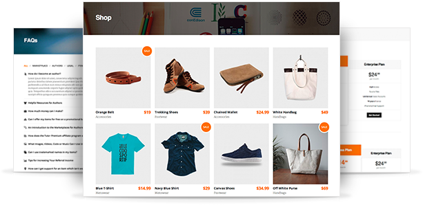
30+ Awesome HTML Pages
Offbeat is fully responsive to the Core. Each and every element resizes or aligns itself beautifully according to the User’s Viewport and provides rich User Experience. Resize the Browser to see how well Offbeat adapts to all the Screen Sizes.
All the Sliders have made responsive so that it adapts well to all the Screen Sizes. The Sliders and Carousels support Touch Swipe Support so when you are using your Touchscreen Mobile Device or a Tablet, you get to interact with the touch of your Fingers.
See more Features


